


Choosing the right interior paint colors is one of the most stressful decisions homeowners face in Roselands. Will that beautiful taupe look too beige in natural light? Will the feature wall overwhelm the room? These are common concerns that keep homeowners up at night when planning their interior painting project.
With over 20 years of experience providing interior painting Roselands and greater NSW, PSG Painting has witnessed thousands of color decisions. Some have been brilliant transformations, while others have led to expensive regrets and complete repaints.
The good news? You don’t have to rely on guesswork or gamble with your hard-earned money. This comprehensive guide reveals the proven strategies our professional interior painters Roselands use to help homeowners choose interior paint colors they’ll love for years to come.
Why Choosing the Right Interior Paint Color Matters
The True Cost of Paint Color Mistakes
Making the wrong paint color choice isn’t just disappointing it’s expensive and time-consuming. Many Roselands homeowners don’t realize the full impact until it’s too late and the paint is already on their walls.
Repainting a standard room costs between $800 to $1,500 in the Sydney area, including labor and high-quality materials. This doesn’t include the emotional stress of living with a color you hate while waiting for the repaint to be scheduled.
Beyond the financial impact, there’s the time loss of waiting for new paint, rescheduling house painters Roselands, and living with disruption. If you’re planning to sell your Roselands property, bold or unconventional interior paint colors Roselands can reduce buyer interest and slow down your sale significantly.
In PSG Painting’s 20+ years serving NSW homes, we’ve found that approximately 15 to 20 percent of homeowners request color changes. These changes almost always happen during or immediately after completion, typically due to inadequate testing before committing to a color.
Understanding How Paint Colors Actually Work in Your Home
The Lighting Factor: Why Colors Look Different Everywhere
The single biggest reason Roselands homeowners regret their interior paint choices? They don’t understand how lighting transforms color appearance throughout the day. Natural light direction plays a massive role in how your paint colors will look from morning to night.
North-facing rooms in the Southern Hemisphere receive consistent, moderate natural light throughout the day. Colors appear truer to the paint chip but can look slightly cooler in tone, especially during winter months when sunlight is less intense.
South-facing rooms get intense, warm sunlight during most of the day. Interior paint colors appear brighter and warmer in these spaces, especially during afternoon hours when the sun is strongest and streaming through windows.
East-facing rooms enjoy warm morning light that gradually shifts to cooler tones by evening. Morning rooms benefit from energizing colors, while you’ll see more muted tones later in the day as natural light fades.
West-facing rooms start cool and dim in the morning, becoming intensely warm and bright in late afternoon. This dramatic shift can completely transform how your interior paint colors look, sometimes making them unrecognizable from the original sample you tested.
PSG Painting’s Professional Tip: Paint your sample boards and observe them at 9am, 2pm, and 7pm for at least three consecutive days. Interior paint colors that work in all three lighting conditions are your safest bet for long-term satisfaction in your Roselands home.
How Artificial Lighting Changes Interior Paint Colors
Your lighting choices dramatically affect paint color perception in Roselands homes. Different bulb types cast different color temperatures that can completely change how your walls appear at night compared to daytime.
LED cool white (5000K to 6500K) makes interior paint colors appear crisper and more defined but can add blue undertones. This type of lighting makes warm colors appear flat and can make your carefully chosen beige look gray or washed out.
LED warm white (2700K to 3000K) adds a yellow or orange cast to your walls, warming up cool interior paint colors significantly. If you chose a cool gray, it might look beige or even slightly peachy under warm LED lighting at night.
The Undertone Mystery Solved
Understanding undertones is where most Roselands homeowners struggle with interior painting. Every paint color has an undertone—a subtle hint of another color that emerges in different lighting conditions and can completely change the appearance of your walls.
“Gray” interior paint colors often have blue, green, or purple undertones that appear much stronger on your walls than they did on the tiny paint chip. What looked like a perfect neutral gray in the store can turn lavender or mint green on your walls at home.
“Warm whites” can reveal peachy or yellow undertones in bright natural light that clash with your furnishings. This is particularly problematic if you have cool-toned furniture or silver fixtures throughout your Roselands home that don’t coordinate.
PSG Painting’s Testing Method: Paint your sample directly next to your flooring, cabinetry, and existing features. If the undertone clashes, you’ll see it immediately rather than after we’ve painted your entire Roselands home and it’s too late to change easily.
The PSG Painting Color Selection Process: Step-by-Step
Step 1: Consider Your Home’s Fixed Elements
Before looking at a single paint chip for your interior painting project, inventory what you CANNOT change. These permanent features will influence every color decision you make and ignoring them leads to disappointing results that don’t work with your home.
Your flooring materials and colors (timber, tiles, carpet) are typically expensive to replace and must work with your paint choice. Orange-toned timber floors will clash with cool grays, while cool-toned tiles might make warm beiges look yellow and dated.
Kitchen and bathroom cabinetry finishes are another major consideration for Roselands homes. If you have honey-oak cabinets from the 1990s, certain paint colors will emphasize their dated appearance rather than complementing them or making them look better.
Professional Example: PSG Painting recently worked with a Roselands client who loved deep navy interior paint colors for their living room. However, their orange-toned timber floors would have created a jarring clash that would make the room feel uncomfortable and disjointed. Our interior painters Roselands recommended a complementary blue-gray that honored their preference while harmonizing beautifully with the flooring—they absolutely love the result.
Step 2: The Proper Paint Testing Method
This is where most DIY enthusiasts go wrong with interior paint colors. Proper testing is the single most important step in the color selection process, yet most homeowners skip or rush through it and end up disappointed.
Purchase sample pots of your top three to four interior paint colors Roselands (250ml tester pots are sufficient). Testing more than four colors becomes overwhelming and makes decision-making harder rather than easier for most Roselands homeowners.
Apply TWO coats to large boards following the manufacturer’s instructions. One coat of interior paint looks completely different than two coats—the true color only emerges with proper coverage just like your final walls will have once we complete the project.
Live with your samples for at least three to five days minimum. Interior paint colors reveal their true character over time as you see them in different weather conditions, lighting scenarios, and moods throughout the week.
View your samples in morning light, midday sun, evening natural light, and at night with artificial lighting only. A color that looks perfect at 2pm might look terrible at 8pm under your LED downlights when you’re actually home relaxing.
Common Mistake to Avoid: Don’t just look at tiny paint chips under fluorescent lighting at the hardware store. A two-centimeter paint chip under artificial store lighting bears absolutely no resemblance to how that interior paint color will appear on your four-meter wall in natural Roselands sunlight.
Top Interior Paint Color Mistakes Roselands Homeowners Make
Mistake 1: Choosing Colors in Isolation
Many Roselands homeowners fall in love with a paint color online or in a magazine without considering their specific home environment. Pinterest and Instagram are wonderful for inspiration but terrible for actual color selection without considering your unique space and lighting.
Why This Fails: That stunning charcoal gray you saw in a Scandinavian home with massive windows will look completely different in your standard Roselands bedroom with moderate natural light.
PSG Painting’s Solution: Always test interior paint colors Roselands in YOUR specific space with YOUR lighting conditions. What works beautifully in a renovated terrace in Newtown might look terrible in a brick veneer home in Roselands due to different light quality.
Mistake 2: Painting Everything White “To Be Safe”
Many nervous Roselands homeowners default to all-white interior paint colors thinking it’s the safest choice. While white can be beautiful, it’s not the foolproof solution most people think it is when choosing paint colors.
Why This Fails: Not all whites are created equal. Cool whites can make rooms feel sterile, while warm whites can look dingy or yellow in certain lighting conditions throughout the day.
PSG Painting’s Solution: If you love light, neutral interior paint colors Roselands, consider warm grays, soft taupes, or creamy off-whites instead. These provide warmth and sophistication while remaining neutral enough for future resale.
Mistake 3: Underestimating How Much Lighter Colors Look on Walls
Paint colors always appear lighter and brighter when covering an entire wall compared to a small sample chip. This is a common complaint PSG Painting hears from DIY painters who didn’t test properly.
Why This Fails: That “perfect gray” sample chip becomes a much lighter, almost white shade when painted floor to ceiling in your Roselands living room.
PSG Painting’s Solution: Go one to two shades darker than your initial choice for interior paint colors Roselands. Test this darker shade alongside your original preference—you’ll likely find it matches your vision better.
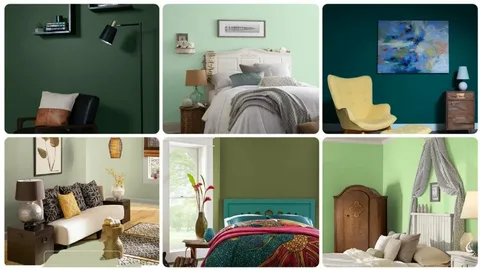
Best Interior Paint Colors for Roselands Homes
Living Rooms and Open Plan Areas
- Warm Gray (Dulux Lexicon Half): Sophisticated, contemporary, and neutral. Works with both warm and cool accents—ideal for open-plan Roselands homes.
- Soft Greige (Dulux Natural White): Combines gray and beige for warmth without looking dated. Complements timber flooring and modern or traditional furniture.
- Warm White (Dulux Vivid White): Brightens spaces without starkness. Reflects natural light beautifully in north-facing living rooms.
Bedrooms for Rest and Relaxation
- Soft Blue-Gray (Dulux Tranquil Retreat): Promotes calm and relaxation, perfect for west-facing bedrooms.
- Warm Taupe (Dulux Hog Bristle): Cozy, sophisticated, and pairs beautifully with natural timber furniture.
- PSG Painting’s Advice: Avoid bright yellows or reds in bedrooms; they stimulate rather than relax, affecting sleep quality.
How PSG Painting Helps Roselands Homeowners Choose Colors
Free Color Consultation Service
When you book interior painting services Roselands NSW with PSG Painting, we provide complimentary color consultation. This ensures you’re confident in your choices before a single brushstroke.
The consultation includes assessing natural lighting in all rooms, reviewing fixed elements like flooring, cabinetry, and architectural features, and discussing your lifestyle and long-term property plans.
We help homeowners balance current trends with timeless interior paint colors Roselands, ensuring a cohesive and professional result.
Why Experience Matters for Color Selection
PSG Painting has completed over 2,000 interior painting Roselands projects across NSW. This extensive experience helps prevent costly mistakes and ensures beautiful, lasting results.
We know how hundreds of different interior paint colors Roselands perform in real homes. Some colors that look perfect initially fade badly, while others improve with age and maintain their beauty.
Our expertise guides you in choosing colors that increase property value, avoid resale pitfalls, and match your home’s natural light, fixtures, and furnishings.
Frequently Asked Questions About Choosing Interior Paint Colors
- How long should I test paint colors before deciding?
Test colors for 3–5 days in your Roselands home, observing them in natural and artificial light for accurate results. - Should I use the same color throughout my home?
Use one main neutral for open-plan areas and 2–3 complementary colors for private rooms to keep flow and variety. - What’s the best approach if I’m selling soon?
Stick to neutral tones like warm whites, soft grays, or gentle beiges to appeal to the broadest buyer base. - How do I pick colors for low-light rooms?
Choose warm, light shades (off-whites, soft creams, pale yellows) to brighten and warm dark Roselands rooms. - Why does my paint look different than the store sample?
Walls reflect more light, and undertones show differently; always test two coats on large boards in your home.
Final Thoughts
Choosing interior paint colors for your Roselands home doesn’t have to be stressful or risky. By understanding how lighting affects color, testing samples in your space, and seeking guidance from professional interior painters Roselands, you can select colors you’ll love for years.
PSG Painting has helped thousands of NSW homeowners navigate this decision over 20+ years. Our color consultation service, combined with expert interior painting application, ensures your vision becomes a beautiful reality.
Ready to transform your Roselands home with the perfect interior paint colors? Contact PSG Painting today for a free consultation and quote. Phone: 0491 105 917
Email: info@psgpainting.com.au


Leave a Reply