The 1st impression symbols- the ‘Brand Logos’
Before we begin, lets validate how impressed we are with these symbols: 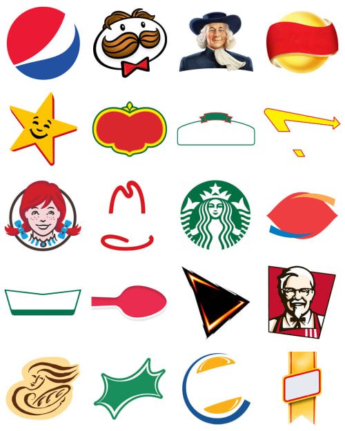
How many of these 20 symbol do you recognize?
The symbols you recognize are the ones which created the lasting 1st impression on your mind and thus can be classified as a successful ‘Brand Logo’
What Is a Logo?
A logo is a graphic mark, emblem, symbol, or stylized name used to identify a company, organization, product, or brand and depict the purpose of the business. It may take the form of an abstract or figurative design, or it may present as a stylized version of the company’s name if it has sufficient brand recognition. Logo’s convey the Brand message and establishes an everlasting connection with the target audience.
Logos have become an integral part of companies’ brand identities. A widely and instantly recognized logo is a valuable intangible asset for a corporation and is thus trademarked for intellectual property protection in the majority of situations.
KEY TAKEAWAYS
- A logo is a visual symbol used to instantly identify a company, organization, product, or brand.
- Logos may show an entity’s name spelled out with letters or they may be abstract designs, such as the Nike stripe.
- Some logos contain hidden messaging, for example, keen observers will notice how the FedEx logo contains a white arrow shape, in the negative space between the letters E and X, to symbolize delivery accuracy.
- Logos are an important part of a brand’s identity, and instantly recognizable logos are valuable property to a company.
- Logos are intellectual property protected under trademark law.
After all Logo is the 1st impression of a Brand
What Does a Logo Do?
A logo is important for a number of reasons, mainly being that it:
- Makes a great first impression, which invites customers to interact with your brand
- Helps you to create a brand identity
- Gives your company a symbol through which people can better remember you
- Distinguishes you from competitors
- Fosters brand loyalty
“If designed correctly, a logo can make future branding efforts a walk in the park”
Logo Origination: Logos have been in existence for thousands of years. The earliest logos were nothing more than simple distinctive markings, symbols, or literal brands, that were created to signify the maker of a product or communicate the type of products that a particular merchant was selling.
For example, under the reign of Henry III, in the year 1266, England’s Parliament passed legislation requiring that all bakers use a distinctive mark for the bread they sold.
Brand Logo- Components, Top featured Logo's, Uses, Brand Logo Stories, Logo Evolution
Components of a Logo
1. Color - Colors go way beyond aesthetic appeal – they’re the core communicators of your message. They tell your audience if you’re playful or serious, innovative or wholesome, cutting-edge or timeless and stable.
Your logo color palette can be made up of a single color or several (although we recommend staying within a two- or three-color combination). The colors you pick will later seep into other branding materials you create as well, so choose wisely!
(Check out this post for more about what your logo colors mean).
2. Typography - This is basically what all of us non-design folks think of as a font; typography includes he letters you’d see in a logo, arranged in some kind of consistent design. You’ll find logos built around a single letter, a monogram, or even the full name of a business.
3. Image - An image can range from the simplest arrow to a detailed rendition of an abstract orangutan. It can be an icon, a symbol – perhaps a picture that represents something you sell or a value you stand for.
If you’re choosing to go with an image, remember that your logo will likely need to be resized depending on where it’s being placed; try to use something that looks clear and scalable.
4. Tagline - Situated under a logo, a tagline typically comprises of a sentence or catchphrase designed to hook your audience, or clarify what your company does.
Logos don’t necessarily need to be accompanied by a tagline, but it’s something to consider if, say, your logo image alone is an abstract interpretation of the concept of Harmony – while it may communicate your values, it doesn’t actually tell your customers anything about your business.
What Makes a Logo Stand Out?
This depends on the company, audience, intended message and logo design – logo effectiveness can be pretty subjective and variable across industry or business. There are four broad goals you should aim for when creating a logo:
- It should be audience-appropriate - The best logos aren’t the flashiest, but rather those that resonate with their target audience. Logos represent not only your company, but also the people to whom you speak. For example – you wouldn’t use bright and peppy colors (read: bright yellow) for a funeral home, in the same way as you wouldn’t use depressing grays for a children’s party planner.
- It should be easy to read - This is particularly true for wordmark logos (logos that consist of text only)but applies to every design style. If your target audience is forced to decipher what your logo means, they’ll be gone faster than you can say “conversions.” Make sure your logo can be easily understood from just a glance.
- It should be distinct - Drawing inspiration from industry trends is always a good starting point, but remember that the goal of a logo is to differentiate your brand from the competition. Distinct = memorable, and that’s what will remind customers why your brand is the one in the industry that they should be loyal to.
- It should be scalable - We mentioned this above, but it’s important enough to emphasize again. Your logo will be placed prominently across several media channels, and in varied sizes; because of this, the best logos are versatile logos ones that can easily be scaled to fit any branding need you may encounter.
Some of the Greats !!
Let’s take a few examples of iconic logos and see how they get the job done-
What do you do with Twitter? You Tweet – and so does this bird.
The logo is simple and easily understood – everyone can tell it’s a bird – and communicates what you can do with Twitter in a single image. Its size and color make it attention-grabbing, while its simplicity subtly reminds the audience that using Twitter is easy and straightforward.
McDonald's
These yellow arches would be recognized from a mile away – which is the point. Originally meant to capture the attention of passers-by, McDonald’s built their stores around these arches, which they later incorporated into their logo.
The colors are bright and happy, and the shape of the “M” reminds you of those famous, Mickey D’s fries – the ones you just can’t wait to get your hands on.
Amazon

The name of this retail giant was inspired by the Amazon river (the longest in the world), which is why it makes a great basis for their logo.
While adding a little zest to the logo, the arrow underneath the name also implies that Amazon sells every product from A to Z – in the curved shape of a smile, because they keep their customers happy.
Apple

We couldn’t not mention our favorite techies, whose classic yet simple logo has become globally recognized as a symbol of innovation and panache.
Like Twitter’s logo, the Apple icon is uncomplicated – but rather than representing an action, it stands for the name of the digital corporation. Its black and white palette is sleek, and the bite taken out of the fruit both invites customers to “eat the apple” (engage with the brand) and plays on the word “byte” – a foundation of computing. Not bad for a mere icon!
Different Uses for a Logo
First rule of branding: Logos should be placed anywhere your product, company, and brand are represented.
Websites: Displaying your logo at the top of your site increases your brand visibility and instantly tells consumers who they’re visiting.
Business Cards: Your branded (read: with logo) business cards are an excellent way to get your name out there and give your customers a tangible way to remember you.
Marketing Materials: Ads, brochures, product packaging, social media posts, newsletters – any time you create a marketing tool or material, your logo should be standing at attention.
Presentations: On the business side, your presentations should always include a clear indication of the brand you represent – symbolized by your logo.
Company Communications: Including logos in letters, emails, memos, and other communications reinforces your brand – not only for customers, but also for your employees – ultimately connecting your company culture with the brand representing it.
Top 5 Brand Logo Story:
Almost every established brand has a history and some interesting story as to how - after a lot of brain-storming and research - the designers and marketers came up with the logo.
1. IBM
 IBM, which started as the International Time Recording Company (ITR), in 1888, changed several names and logos before it came to be called the International Business Machines Corporation. The current logo, designed by Paul Rand, was introduced in 1972. The horizontal stripes forming the letters IBM are suggestive of the 'speed and dynamism'.
2. Nike
Nike has a simple yet powerful logo. Nike is the Greek goddess of victory. The logo is derived from her wing, ‘Swoosh'. Greek mythology says that Swoosh is the giver of immense power and motivation to the warriors. This makes it the perfect logo for an apparel and accessories brand for sportspersons.
3. BMW
The BMW logo speaks of its history in aviation during World War II, when the company used to create aircraft engines for the German military. The blue and white in the logo depict the propeller in motion, with the sky peeping through it.
4. Nestle
The Nestle logo was designed in 1868 by Henri Nestle, based on the meaning of his name in German. The logo also included a little nest, and his family emblem. Later on, as the logo evolved, the mother bird's beak was removed and the three fledglings were reduced to two to depict an average modern family.
Last- The most brilliant piece:
5. FedEx
The FedEx logo is brilliantly designed. It is the winner of over 40 design awards and is considered one of the best logo designs for the clever use of negative space. The hidden arrow, connotes forwards direction, speed, and precision.
Evolution of Brand Logos:
Check do you recognize these logos now:

DID YOU RECOGNIZE ANY OF THE ABOVE?
ANS: In order the Logo's are of Shell, Canon & Buick
Spiffy isn't it??
Top 5 Brands Logo’s that evolved over years:
Brands need to evolve to stay relevant—and so do their logos. What was spiffy, neat and keen in the 1950s, brought into present day just looks kind of weak sauce. If a brand wants to come across as modern or cutting edge, they need to regularly redesign and update their logo by modern standards. Logo evolution, survival of the stylish.
Long gone are the days of literal logos, where a company called Shell could just use an ambiguous illustration of a seashell and that was enough to satisfy consumers. That original shell comes from 1900, and it wasn’t until 1904 that we see something recognizable to today’s version.
1. Shell:
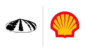
Shell logo, 1904
Here we see the definitive, front-facing shape of the popular shell logo, which removes much of the ambiguity over what the object actually is. Although it’s done in a realistic style, those kinds of details aren’t as popular nowadays because they’re hard to make out at a distance and a lot is lost when replicating them at smaller sizes, like smartphone icons.
What’s really interesting, though, is we see the origin of the ridges that exist in their modern-day logo. Today’s Shell logo features a series of leading lines pointing to the near-center of the design, a design technique that makes the logo, and the brand by extension, seem more dynamic and active.
Shell logo, 1948
In 1948, Shell introduced their iconic yellow-red color scheme, which makes sense considering the psychology of color and technology in that era allowing easier color printing. The choice of yellow and red is an interesting one—this color pairing is usually reserved for the food industry (McDonalds, Denny’s, etc.). As warm colors, yellow and red both energize and invigorate the viewer, which complements their dynamic use of leading lines discussed above.
From their introduction of color, Shell’s logo evolved to become more minimalistic—smoother edges, less details and a bolder outline. And thanks to their brand awareness, not to mention an appropriate choice of logo imagery, they can safely remove their name from the logo and consumers still know who they are.
2. Baskin-Robbins
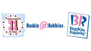
Baskin-Robbins logo evolution from 1945 to today
The first logo Baskin-Robbins used isn’t bad per se, merely outdated. But the Baskin-Robbins logo evolution is a case of improving on the original rather than “fixing” it.
From the start, the main selling point of Baskin-Robbins, compared to rival ice cream vendors, was their wide selection of flavor options. We don’t even need to tell you how many, because their branding has done its job over the years. It was always a smart choice to include that number in their logo so ice cream fans would associate the Baskin-Robbins name with a multitude of flavors.
Baskin-Robbins logo, 1991
They stuck it out with their original logo until the 90s, when they opted for a more modern, minimalist style and a more focused color scheme of pink and blue. Front and center, though, is their iconic “31,” again surrounded by a circle to underscore its importance. Although subtle, the circle is cut off at the bottom, resembling an ice cream scoop.
In 2006, they redesigned their logo into the current version: a visual pun that combines the “31” with the initials “BR”. This builds on the strategy they’ve used since the beginning—associating their brand name with their top selling point of flavor variety—and takes it to the next level with an image that tends to stick in viewers’ minds.
3. Levi’s

Levi’s logo evolution from 1890 to today
Unlike other logo evolutions on this list, Levi’s embraces their original designs instead of burying them. You can still see a variation of their first logo, albeit a simplified version, embedded on some of their flagship jeans. After all, two horses failing to rip a pair of jeans in half still communicates the product’s sturdiness, just as it did in 1890.
The story of Levi’s logo evolution is one of minimalism and simplification. While that detailed and wordy logo was normal in the 1800s, over a century later it looks out of place on a tablet screen or digital billboard. So Levi’s minimized everything, including their brand name.
Their current logo is small and simple enough to print clearly on a centimeter-long tag. The choice of red, one of the most attention-grabbing colors, makes it easy to stand out as well. And when the brand does have the opportunity to feature a more detailed logo, they can fall back on their original, just to remind their customers, “hey, we’ve been doing this for over a hundred years!”
4. Canon
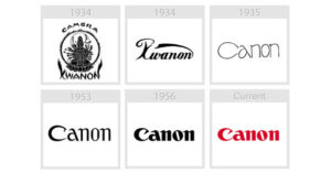
Canon logo evolution from 1934 to today
Although most of us assume Canon gets its name from the English “cannon,” it’s actually the Japanese spelling (“Kwanon”) of a Chinese goddess in Buddhist mythology. Canon’s predecessor, Precision Optical Instruments Laboratory, produced the first “Kwanon” camera in 1934. According to Canon’s website, they choose this Goddess of Mercy because she “embodied the Company’s vision of creating the best cameras in the world.” Take that factoid to quiz night.
Canon logo, 1935
The name, along with the religious imagery, did not translate well to American markets, so the company revised it quickly and registered the “Canon” trademark in 1935. That’s when we see the originals of their modern wordmark logo—with a spelling variant that seemed “right at home” for English speakers.
Over the last century, the logo format has stayed largely the same, but with increasingly refined typography. As the decades piled on, the letter strokes got bolder and the serifs more pronounced, plus they added the attention-grabbing red color—all techniques commonly used with wordmark logos as a way to keep them visually interesting without other imagery.
The most exceptional one
5. Buick
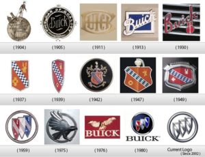
Buick logo evolution from 1899 to today
What was wrong with Buick’s first logo, you say? What says “modern car company” better than a dapper man in a top hat walking across the arctic circle dragging a primitive steam engine?
Like Pepsi, Buick has reinvented itself over and over again. They’ve used all sorts of logos throughout their 116 years, from nearly illegible wordmark logos…
Buick logo, 1911
… to royal shield crests with esoteric deer symbolism.
Buick logo, 1942
It was from that shield logo that their current logo was born. We see a lot of similar elements besides just the shield: the red, white and blue color scheme, as well as the diagonal checkered band that lies across the shield.
Buick logo, 1959
You can see the similarities yourself when you look at the 1959 version: it seems Buick knew precisely what they wanted to keep and what they wanted to get rid of.
Buick logo, 1975
You would think it was a quick step from that to their modern logo, but that journey wasn’t exactly a straight path.
In the 70s Buick ventured completely off course with a new bird of prey logo, one with no acknowledgement to the logos that came before.
Buick logo, 1980
This diversion was short-lived, however, and by 1980 they were back on track with the three-shield logo we know today. The only major changes since then were in 2002, when they abandoned the colored logo for a silver monochrome one we know today.
The moral we can all learn from Buick’s logo evolution is a timeless one: if at first you don’t succeed, try and try again.
- Some other Brand Logo Evolution: https://www.hongkiat.com/blog/logo-evolution/
- Top 10 best brand logos ever made- https://www.inc.com/larry-kim/the-10-best-logos-ever-made.html
Brand Logo - Rebranding in 2021, Rebranding during the ' Pride Month'
G-mail to leverage Brand LogosBrand Logos that rebranded in 2021
In 2021, more than ever it is important to keep your brand fresh and adaptive. Last year was a real struggle for many businesses. They had to overcome political strife, racial injustice, and a global pandemic. Businesses must adapt with the world in order to overcome challenges in the marketplace.
A logo is one of the most important visual elements a brand can use to communicate its objectives. It is therefore important for brands to consider a logo rebrand at some point to highlight the key strengths and to reflect core business values.
If you are thinking of undergoing your own rebrand and need inspiration, I have rounded up the biggest logo changes of the year, and will be updating this page as they are released.
Burger King
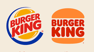
The new design is simple and fun. The lettering is much more rounded and somewhat retro in style.
The new logo calls heavily on Burger King's past. It greatly resembles a design they used during the 1970s and 80s. The brand believes this was when Burger King was at its strongest and now aims to reposition themselves with this era of success. The removal of the blue swish is meant to symbolize the removal of preservatives and artificial flavorings from their food. The colors in the logo are inspired by the food, with the browns and yellows representing flame grilling.
At first I didn’t like the design but after looking back on their previous logo, I think it is a good step forward. Their original logo does look dated in comparison. The new design also works much better on digital platforms.
Pfizer
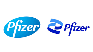
After recently creating the Covid vaccine, the company has revealed their new logo, which aims to shift the brand from “commerce to science”.
The new design is inspired by DNA’s double helix structure, and replaces the pill shaped logo they had before. They have described it as “unlocking the pill to reveal Pfizer’s DNA: the power of science”. With the logo comes a new color scheme and typeface. The colors have been toned down from eight to two, in industry standard blue.
I really like the design. It is current, and a lot more interesting to look at. By removing the gradient, the logo is a lot more usable on digital platforms. The rebrand has come at a good time for the company, as their reputation has improved after their vaccine breakthrough.
CIA
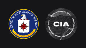
The rebrand comes at a time when the CIA are looking to encourage diverse applicants “from people of all backgrounds and walks of life”. The rest of their brand is clean, bold and modern, unlike their new logo which is anything but simplistic. The new design incorporates waveform curves in black and white. A bold sans-serif font now includes the agencies initials. The only thing it retains from the original is its circular shape.
The new design has been met with criticism and mockery. In true CIA fashion, the identity of the designer remains classified.
Personally I do not like the new design. It looks like something you would see in a dystopian, sci-fi movie or video game, not as an official emblem of a government agency. The lines on the background make the lettering too hard to read. It will suffer when scaled down, so it is not at all suited for digital platforms.
General Motors
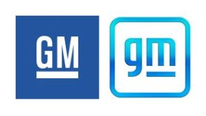
General Motors is the parent company to brands including Chevrolet, Buick and Cadillac. Their new logo is meant to reflex the company’s electric vehicle campaign, which aims to reduce emission and create an all-electric future.
Along with the logo comes their new tagline “The clean skies of a zero-emissions future”. The design aims to showcase this message, employing a sky blue gradient. The company’s initials are displayed in a new lowercase font. The line under the m is retained from their previous design. It has been stated that this is meant to represent a battery range, where the negative space under the m is a reference to the shape of a plug.
I personally am not a fan of this logo. It looks very generic and uninteresting. The gradient looks a little outdated, and will struggle on digital platforms. The font for the lettering needs to be reworked into something more unique to the brand.
Dacia
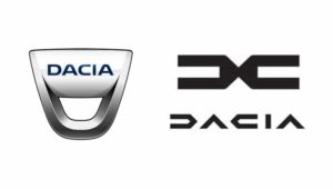
Dacia is a Romanian car manufacture owed by Renault. As part of the company’s new development plan, known as the “Renaultlution”, they have showcased their new SUV displaying their new logo.
The new design showcases an angular symbol, meant to represent two D’s. New lettering sits below this, which takes on a futuristic styling.
Dacia seem to have gone the same way as other ca manufacture by ditching gradients and bevels, and opting for a flat, stylish design. I love this new logo. I especially love the lettering. It seems to fit in with their overall brand nicely.
Warner Brothers
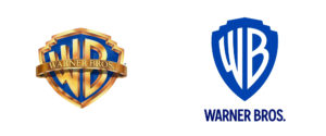
In 2019 Warner Brothers revealed their new flat logo to celebrate their centenary. The iconic gold shield was removed, and the initials were changed to white. The new design did not go down very well fans.
Over 2 years later, the updated design finally appeared onscreen attached to the film Locked Down, although slightly different. A touch of 3D had been added to the design, with the edge of the shield and the initials new rendered in metallic silver. It has been speculated that Warner Brothers listened to their fans, striking a medium between the two designs.
I like it. This is what I wanted to happen back in 2019. I felt the design stripped away too much, so it’s nice to see it retain some of its iconic features. If I was to nitpick, I would have preferred it remain gold rather than silver.
See Also: https://multiplegraphicdesign.com/blog-biggest-logo-rebrands-2020.html
Brands mark 'Pride Month'
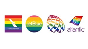
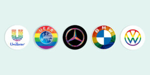
Brands across categories are riding on the rainbow euphoria as June is observed as Pride Month globally, a movement that brings the entire LGBTQIA+ community together to spread the message of equality.
Now that you have a clearer understanding of what a logo is and the role it plays in your brand image; How impressed are you with this article??
Reads: Google mail to roll out authentic brand logos to stop forging and duplicity- https://www.theverge.com/2021/7/12/22573813/google-authenticated-brand-logos-gmail-rolling-out-bimi-dmarc
- https://www.livemint.com/technology/tech-news/gmail-will-start-attaching-brand-logos-on-emails-to-deter-hackers-11626169794500.html



Leave a Reply