






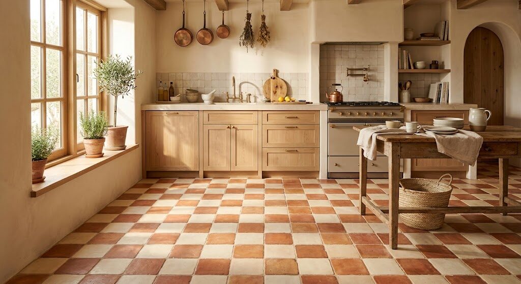
Few flooring patterns have the staying power of checkerboard floor tiles. From historic European interiors to classic cafés and contemporary homes, alternating squares have remained relevant across centuries of changing design trends.
Black and white may be the best-known combination, but it is far from the only option. The strength of checkerboard flooring lies in its simple geometry: two contrasting or complementary colors arranged in a repeating grid. Change those colors, and the same classic pattern can take on an entirely different personality.
Warm terracotta can make it feel relaxed and Mediterranean. Navy can introduce sophisticated contrast. Sage green creates a softer, nature-inspired appearance, while mustard yellow can transform the floor into a bold design feature.
This guide explores five checkerboard tile color combinations and the practical considerations—from tile material and grout to scale, lighting, and installation—that can help each palette work successfully.
Why Look Beyond Black-and-White Checkerboard Floors?
Black-and-white checkerboard flooring still deserves its place in interior design. In a marble entrance hall, traditional kitchen, or vintage-inspired bathroom, the strong contrast can create an unmistakable architectural statement.
However, high contrast is not ideal for every room.
In smaller spaces or interiors without strong architectural features, pure black and white can sometimes dominate the visual composition. Introducing color allows the checkerboard pattern to complement the atmosphere of a room rather than automatically becoming its strongest feature.
A warm pairing can make a space more inviting. Muted colors can soften the geometry. Darker hues can provide structure without the severity of black.
The pattern remains familiar, but its emotional character changes completely.
Here are five alternatives worth considering.
1. Terracotta and Cream: Warm and Earthy
Terracotta and cream create a checkerboard floor with an immediate sense of warmth.
Terracotta draws its character from the natural colors of clay, earth, traditional pottery, and Mediterranean architecture. Cream provides a softer counterpoint than bright white, reducing the visual contrast while allowing the checkerboard geometry to remain clearly visible.
This combination can work particularly well in:
- Kitchens
- Entrance halls
- Sunrooms
- Mediterranean-inspired interiors
- Rustic or farmhouse spaces
- Rooms featuring natural timber
One of terracotta’s most appealing characteristics is its natural variation. Depending on the product, individual tiles can contain subtle differences in tone and texture, preventing the checkerboard from looking excessively uniform.
When comparing terracotta options, consider whether glazed or unglazed tile is more appropriate for the room. Glazed surfaces can generally be easier to maintain, while unglazed terracotta can offer greater texture and a more traditional appearance but may require appropriate sealing and maintenance.
Pair the floor with warm woods, natural fabrics, cream walls, aged metals, or earthy ceramics to reinforce the relaxed character of the palette.
2. Deep Navy and White: Classic Without the Severity
For homeowners who appreciate the graphic quality of black and white but want something slightly softer, navy and white provide an attractive alternative.
Navy is dark enough to maintain strong visual structure while introducing more color and depth than black. Against white or a slightly warmer white, it creates a checkerboard that can feel clean, composed, and timeless.
The combination is particularly suited to:
- Bathrooms
- Mudrooms
- Utility rooms
- Kitchens
- Coastal-inspired interiors
- Traditional or transitional homes
In compact rooms, smaller-format mosaic floor tiles can create a more detailed interpretation of the pattern without requiring oversized squares to dominate the space.
Navy and white also pair naturally with simple wall treatments and restrained fixtures. White wall tiles, timber cabinetry, chrome, nickel, or brushed-metal finishes can complement the floor without competing with it.
For a softer result, consider replacing brilliant white with ivory or warm white.
3. Sage Green and Off-White: Calm and Understated
Green has become increasingly versatile in residential interiors, and sage is particularly adaptable.
Sitting somewhere between green and gray, sage can coordinate with warm timber, natural stone, brass, black hardware, and many neutral palettes. When paired with off-white, it creates checkerboard flooring that feels noticeably gentler than conventional black and white.
The choice of off-white matters.
A bright white can increase the contrast and make the individual squares more pronounced. Cream, ivory, or another warm off-white produces a softer transition and allows the pattern to function more like a textured backdrop.
Consider this combination for:
- Pantries
- Laundry rooms
- Powder rooms
- Kitchens
- Garden rooms
- Cottage-inspired interiors
Sage and off-white can be especially effective when the objective is to introduce pattern without making the floor the dominant design feature.
Natural timber cabinetry, woven textures, warm whites, and subtle metallic finishes can complete the palette.
4. Mustard Yellow and Charcoal: Bold and Energetic
Some rooms benefit from restraint. Others provide an opportunity to experiment.
Mustard yellow and charcoal create one of the boldest checkerboard tile color combinations. Mustard contributes warmth and energy, while charcoal provides enough visual weight to control the brighter color.
The result is graphic and expressive without relying on pure black.
This combination is best considered for spaces where a strong floor can become an intentional focal point, including:
- Entrance areas
- Powder rooms
- Creative studios
- Small kitchens
- Hallways
- Eclectic interiors
Scale is particularly important with a bold palette.
In a small entrance or powder room, a mustard-and-charcoal checkerboard can create a concentrated design statement. Across a very large open-plan floor, however, the same colors may become visually demanding.
If you choose a strong palette, consider keeping surrounding finishes relatively restrained. Neutral walls, uncomplicated cabinetry, and a limited selection of accessories can allow the floor to provide the personality without making the room feel overly busy.
5. Dusty Rose and Soft Gray: Subtle and Contemporary
Not every checkerboard needs obvious contrast.
Dusty rose and soft gray demonstrate how the pattern can work with two relatively muted colors. Depending on the lighting, dusty rose can approach the character of a warm neutral, while gray provides a cooler counterbalance.
The checkerboard remains visible, but the effect is more gradual and atmospheric.
This palette can work particularly well in:
- Bedrooms
- Dressing rooms
- Bathrooms
- Open-plan living spaces
- Contemporary interiors
- Soft minimalist schemes
Rather than commanding attention immediately, dusty rose and gray allow the geometry to emerge as people move through the room.
That quality can make the combination particularly useful when the floor needs to add visual interest while remaining secondary to furniture, artwork, or architectural features.
Comparing Checkerboard Tile Color Combinations
| Color Combination | Overall Mood | Works Well In | Design Character |
|---|---|---|---|
| Terracotta + Cream | Warm and earthy | Kitchens, entrances, sunrooms | Mediterranean / organic |
| Navy + White | Crisp and composed | Bathrooms, mudrooms, kitchens | Classic / coastal |
| Sage + Off-White | Calm and understated | Pantries, laundry rooms, kitchens | Natural / contemporary |
| Mustard + Charcoal | Bold and energetic | Entries, powder rooms, studios | Eclectic / modern |
| Dusty Rose + Gray | Soft and sophisticated | Bedrooms, bathrooms, living spaces | Subtle / contemporary |
The best checkerboard floor design is not necessarily the most dramatic. It is the combination that works with the room’s lighting, dimensions, furnishings, and intended atmosphere.
What to Consider Before Installing Checkerboard Flooring
Choosing the colors is only the beginning. Material, grout, tile size, lighting, and installation can substantially influence how the finished checkerboard looks and performs.
Choose the Right Tile Material
The tile should be appropriate for the conditions in which it will be installed.
Porcelain is commonly selected for demanding applications because of its low water absorption and durability. Ceramic tiles can also work effectively in many residential settings, depending on the specific product and application.
Rather than choosing solely on whether a product is labelled ceramic or porcelain, check the manufacturer’s specifications and confirm that the particular tile is suitable for its intended location.
For glazed floor tiles, review the manufacturer’s recommended application and, where provided, the PEI wear rating. Higher wear classifications are generally better suited to areas exposed to greater levels of foot traffic.
Wet areas also require additional consideration. Always verify that the specific tile is suitable for the intended floor or wet-area application and consider relevant slip-resistance requirements.
Treat Grout as Part of the Design
Grout may occupy only a small percentage of the floor, but it can have a significant visual effect.
With checkerboard flooring, grout can either reinforce the grid or soften it.
A grout color positioned visually between the two tile colors can create a relatively balanced result. Matching the grout closely to one of the tiles may cause that color to appear more dominant.
Dark grout can provide stronger definition and may disguise some everyday discoloration more effectively. Light grout can maintain a brighter appearance but may require more attentive maintenance depending on the environment.
Whenever possible, test grout samples alongside both tile colors before making the final decision.
Test Colors in Your Own Lighting
Tiles can look very different at home than they do in a showroom or online photograph.
Natural light changes throughout the day, while artificial lighting affects color temperature at night. A north-facing room may make some colors appear cooler, while warmer sunlight can intensify earthy tones.
Before ordering the complete floor, obtain samples of both colors and place them together in the room.
Check them:
- In morning light
- Around midday
- During late afternoon
- Under artificial lighting at night
This simple process can prevent an expensive mismatch between the colors you expected and the colors the room actually produces.
Match Tile Scale to Room Size
Tile dimensions affect how the checkerboard pattern is perceived.
Large-format squares produce a bolder and often more contemporary appearance. With fewer grout lines, the pattern can also feel visually cleaner.
Smaller formats, including the two- and three-inch options often available among mosaic floor tiles, create a more intricate surface. They can suit traditional interiors as well as compact spaces where smaller proportions feel more appropriate.
Neither approach is inherently better.
The objective is to make the scale of the checkerboard feel intentional in relation to the dimensions of the room.
One useful technique is to create a temporary paper or digital mock-up showing the proposed tile dimensions before purchasing the full quantity.
Plan the Layout Before Installation
Checkerboard flooring is highly sensitive to alignment.
Because alternating colors create obvious visual lines across the floor, small installation inconsistencies can become much more noticeable than they might on a single-color surface.
Before adhesive is applied, the layout should be carefully planned to establish:
- The pattern’s starting point
- Alignment with major walls and sightlines
- Tile cuts around the perimeter
- Transitions into adjoining rooms
- Position around architectural features
- Consistent joint spacing
A dry layout or detailed installation plan can reveal awkward cuts and alignment problems before they become permanent.
Precision at this stage has an enormous influence on the finished result.
Giving a Classic Pattern a New Identity
Checkerboard flooring has survived changing design movements because its fundamental principle is remarkably adaptable. The geometry is simple enough to feel familiar, yet flexible enough to take on a completely different personality depending on color, material, scale, and surrounding finishes.
Black and white will always have a place, but it does not have to be the default.
Terracotta and cream can introduce natural warmth. Navy and white preserve classic contrast with a softer edge. Sage and off-white bring calmness, mustard and charcoal create energy, and dusty rose with gray demonstrates how subtle a checkerboard can become.
The most successful checkerboard floor is therefore not necessarily the one that follows tradition most closely. It is the one that responds thoughtfully to the room around it.
Choose the palette carefully, test the materials under real lighting, select a tile appropriate for the application, plan the grout and scale as part of the design, and give particular attention to installation.
The checkerboard provides the structure. Color gives it its identity.










Leave a Reply